Overview
A 45-minute queue. For a loyalty card.
To become a Crown Rewards member, customers had to physically visit the resort with ID, queue at the rewards desk, and complete the process with a staff member. During peak periods, that meant up to 45 minutes before they could access the app as a full member.
I was tasked with rethinking the entire signup experience through a digital lens — designing an end-to-end mobile onboarding flow that met Crown's identity, legal, and gaming compliance requirements while getting customers into the app in under 6 minutes.
The Problem
The first moment with Crown Rewards was also the worst moment.
The existing signup process was operationally heavy by design — customers needed to present ID, staff needed to verify it, and the system needed to run compliance checks before membership could be confirmed. None of that was wrong. But the experience of doing it entirely in person, at a desk, during busy periods, was slow for customers and resource-intensive for Crown.
COVID added further urgency. Reducing unnecessary in-person contact wasn't just a convenience improvement — it was operationally necessary. Crown needed a faster, safer, and more scalable path to membership that didn't compromise on the compliance requirements that make the existing process necessary in the first place.
The design challenge wasn't "make the form better." It was: what parts of this process can move to the app, and what still needs to happen at the desk?
My Role
End-to-end — from the gaming floor to the app store.
I led UX and UI design across the full signup experience, starting with operational discovery and ending with dev handoff and UAT support. This wasn't a brief-to-designs project — understanding the operational context was the prerequisite to designing anything meaningful.
Understand
Interviewed operational managers on the gaming floor to map the current-state journey — what customers do, what staff do, which steps are mandatory, and which create the most friction.
Reframe
Reviewed digital onboarding patterns across mobile apps and identity verification experiences. Mapped a future-state flow that separated what could be digitised from what needed to stay at the desk — at least initially.
Design
Created user flows, wireframes and high-fidelity UI. Checked technical feasibility with engineering early — especially for liveness testing, ID capture, and the DVS/PEP/VEVO compliance checks. Presented the journey to business stakeholders.
Deliver
Walked developers through the experience, supported visual QA during build, and contributed to UAT planning and testing.
The Solution
A guided mobile journey — from zero to full member.
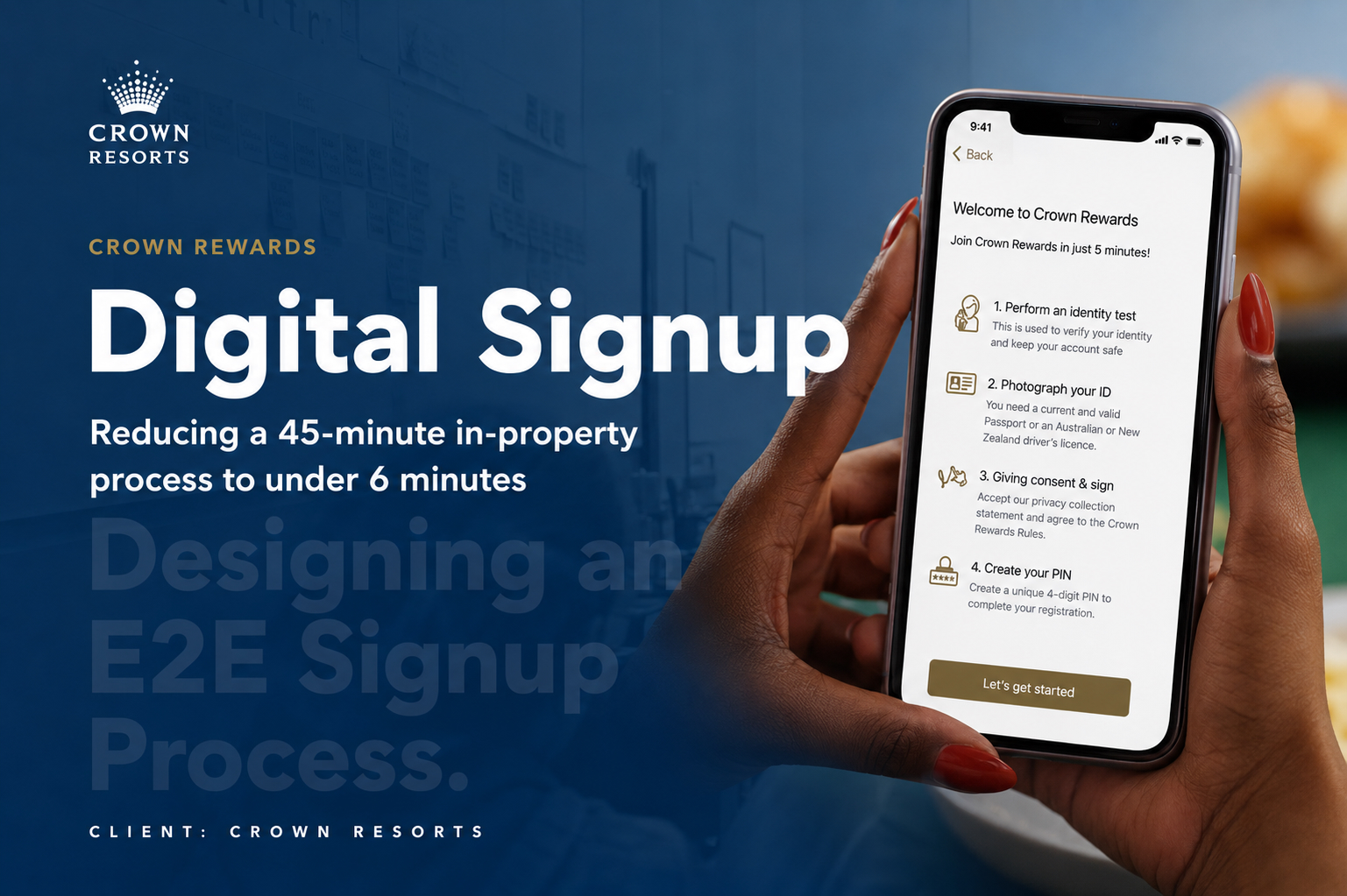
The solution was a step-by-step mobile onboarding flow that handled identity verification, ID capture, details confirmation, consent, digital signature, and PIN setup — entirely within the app. The landing page set expectations upfront, breaking the process into four clear steps so customers understood what was required before they started.
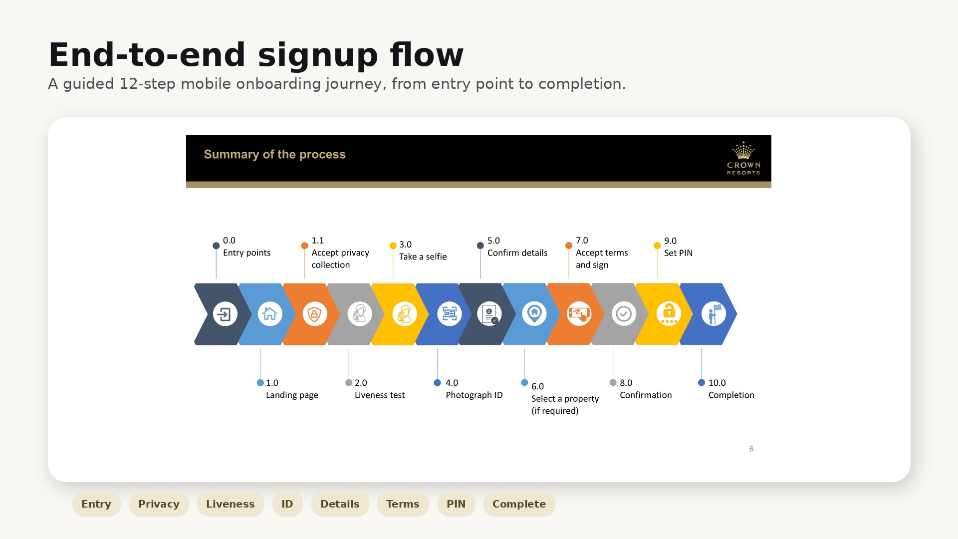
End-to-end signup flow — from app entry to full member login. All images recreated for confidentiality.
The full journey covered 12 steps:
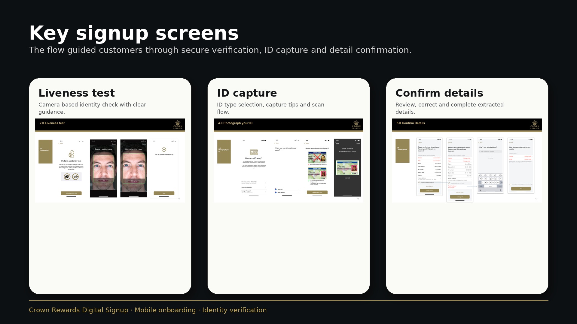
Key screens: liveness test, ID capture and details confirmation. All images recreated for confidentiality.
The improved liveness test removed legacy interactions like blinking — making the experience feel modern and low-friction without reducing the verification quality. ID capture supported driver's licence, Australian passport and foreign passport, with in-app guidance to help customers take a usable photo first time. Poor ID capture was one of the biggest sources of drop-off in similar flows, so getting this step right was critical.
Operational Design
Not everything moved to the app — and that was the right call.
A key design decision was being honest about what the digital flow could realistically replace. Physical card printing still required a desk visit. Some gaming-related questions still needed to be completed in person. Rather than trying to digitise everything at once, the solution created a strong digital foundation that customers could complete before arriving — reducing desk time even when they still needed to come in.
This framing also opened up future opportunities: QR-code-led signup from the queue, a fully digital card eliminating the desk visit entirely, and gaming-floor journeys triggered by the same identity-verified session. The app journey was designed to be a foundation, not a ceiling.
Reflection
Digital transformation is a service design problem first.
The most valuable work on this project happened before any screens were designed — understanding the operational reality on the gaming floor, and separating what could move to the app from what needed to stay at the desk. Designing without that understanding would have produced something technically functional and operationally wrong.
Working closely with engineering early was equally important. Because the flow included identity verification, liveness testing, and compliance checks (Daon DVS, PEP, VEVO), feasibility conversations shaped the design as much as user research did. The best mobile onboarding design is one that can actually be built and maintained at scale.