Overview
Evidence-based decisions, not designer opinions
Sorted Services is a household services app — the kind you use to book tradespeople, track home maintenance, and manage service history. The product had strong fundamentals but the navigation structure and key feature surfaces had grown organically, creating an IA that reflected how the product was built rather than how users thought about their home.
Via SleevesUp, I led two distinct research and design workstreams on Sorted: a usage graph A/B test to determine the most effective data visualisation format, and a card sorting study to redesign the information architecture from the ground up.
Workstream 1
Usage graph A/B test
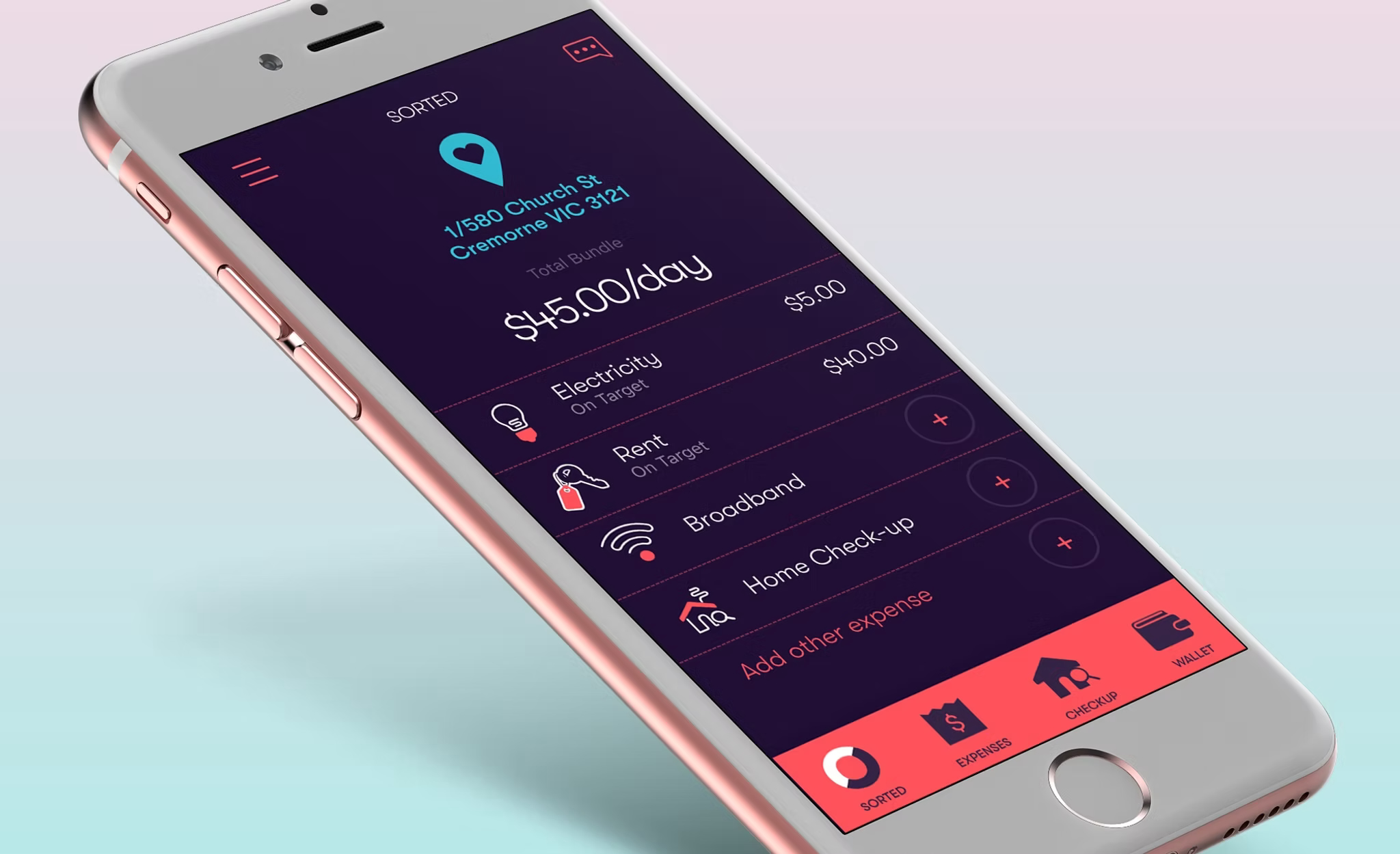
Sorted's home screen featured a usage graph showing household service activity over time. The product team had differing views on the optimal graph format — the debate centred on whether a bar chart or a line graph better conveyed the usage pattern in a way users found meaningful and actionable.
Rather than resolving this through design opinion, I structured it as a properly controlled A/B test: identical data, two presentation formats, engagement as the primary metric (did users interact with the graph and drill into the detail?), and retention as a secondary metric (did the graph format affect return visits to the home screen?).
Control — Bar Chart
Monthly service activity as vertical bars. Familiar, easy to compare across months, clear for discrete time periods.
Variant — Line Graph
Continuous usage trend line. Better at showing trajectory and change over time — but potentially misleading for discrete service events.
The test ran over a sufficient period for statistical significance. The result favoured the bar chart — not because it looked better, but because users were more likely to engage with it and drill into specific months. The line graph, while visually cleaner, created an impression of continuous activity that didn't match users' mental model of home services (discrete events, not ongoing usage).
Workstream 2
Information architecture redesign via card sorting
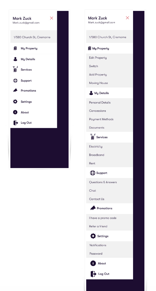
The second workstream addressed a broader navigational problem: Sorted's menu structure had accumulated categories that reflected internal team ownership rather than user mental models. Users frequently couldn't find the right section for common tasks.
"The navigation worked perfectly from the inside out — every team knew where their features lived. It didn't work at all from the outside in — which is the only direction that matters."
Open Card Sort
Ran an open card sort with 30 participants — presenting Sorted's full feature set as individual cards and asking participants to group them into categories they defined themselves. This surfaces the natural mental model without anchoring to the existing structure.
Cluster Analysis
Analysed the sort results using a dendrogram to identify consistent groupings — features that participants reliably put together. Several features that lived in separate sections of the existing IA consistently ended up in the same group across participants.
Proposed IA
Used the cluster analysis to draft a revised navigation structure — reducing the top-level categories from 7 to 5, and repositioning several high-frequency features to match where users expected to find them.
Tree Test Validation
Validated the proposed structure through a tree test — presenting the new navigation to a fresh participant group and asking them to locate specific features. Task success rate improved significantly versus the baseline established on the original structure.
Outcome
Methodology as the deliverable
Both workstreams delivered validated outcomes grounded in user behaviour rather than stakeholder preference. The graph format decision — which had stalled in product meetings — was resolved in weeks. The IA redesign gave the product team a navigation structure backed by data from the actual user base.
More broadly, this project reinforced the value of structured research methods in product decisions that could otherwise be resolved by whoever speaks most confidently in a meeting. Data doesn't eliminate judgment — but it changes the conversation.