Overview
Bridging a language gap in Australian banking
Chinese-speaking Australians represent a significant and underserved segment of the banking population. Navigating complex financial products in a second language — particularly for recent immigrants — creates real friction: misunderstood terms, missed obligations, eroded trust. in1bank was founded specifically to close that gap.
As the sole lead UX designer from product inception, I was responsible for translating a complex regulatory and linguistic challenge into a mobile banking experience that felt native — not translated. That distinction mattered enormously.
The Challenge
Not translation — design for a different mental model
The brief wasn't to build a banking app and then add a Chinese language toggle. The real challenge was designing for users whose financial mental models, banking norms, and trust signals differ from those that Australian banking products are built around.
Chinese-speaking customers in Australia often bring expectations shaped by platforms like WeChat Pay and Alipay — highly integrated, fast, and feature-rich. A stripped-back neobank experience that works for an Anglo-Australian first-time banking user can feel sparse and untrustworthy to this audience.
Language problem
Financial terminology doesn't map cleanly between English and Mandarin. "Redraw facility", "offset account" — these concepts don't have clean direct translations. We needed terminology strategies, not just word swaps.
Trust signals
Trust cues differ across cultures. For many Chinese-speaking users, the visual density, brand authority signals, and reassurance copy that builds confidence is quite different to what works for English-speaking audiences.
Process
Discovery-led, community-grounded
Community Research
I conducted in-depth interviews with recent Chinese migrants and long-term residents across Melbourne — focusing on financial onboarding pain points, current workarounds, and moments of confusion with existing banking products. Sessions were conducted in Mandarin where participants preferred it.
Terminology Workshop
Working alongside a bilingual financial consultant, I developed a terminology guide for all core banking concepts — balancing regulatory accuracy in English with intuitive, non-literal Mandarin equivalents. This became a shared reference for the entire product team.
Architecture & Flows
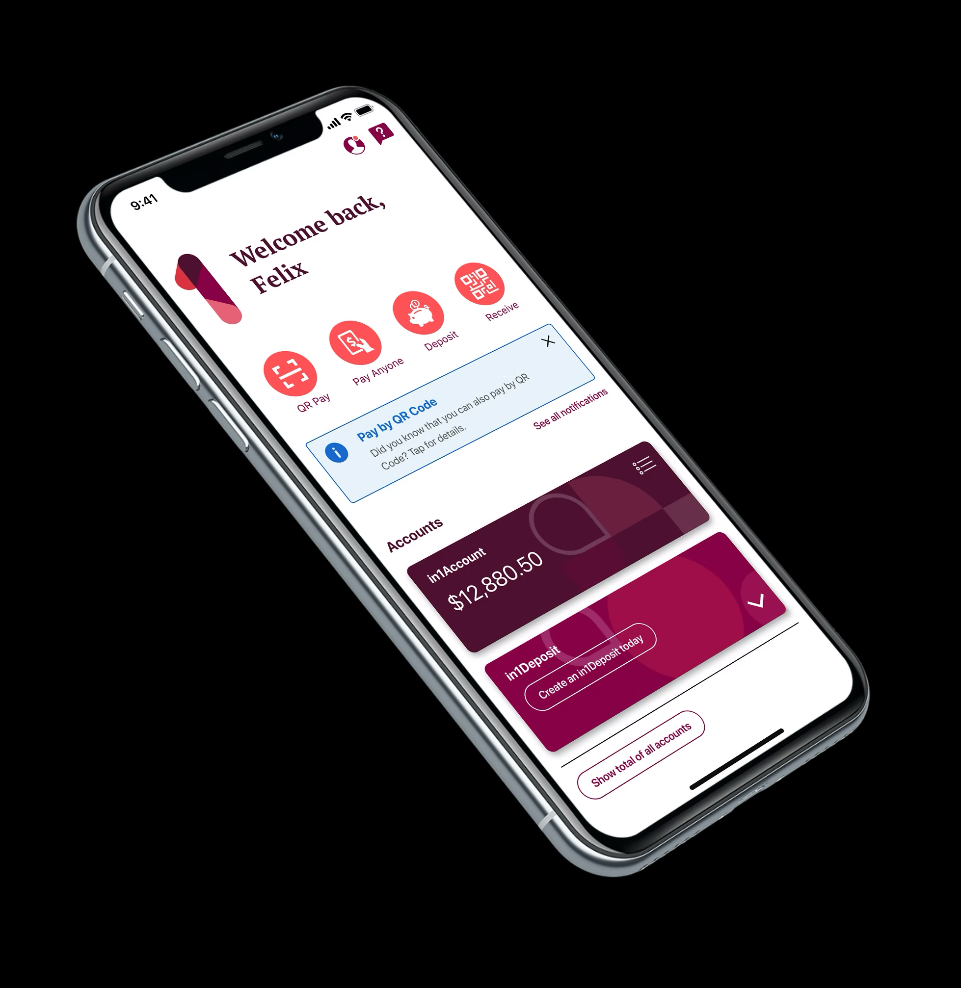
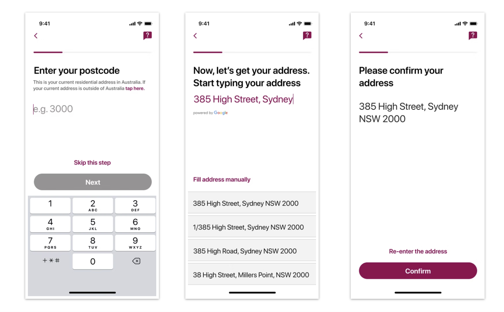
Mapped the full app architecture: onboarding and identity verification, account management, transfers (domestic and international), card controls, and notifications. Ran card-sorting exercises with representative users to validate information architecture before wireframing.
Prototype Testing
Built interactive prototypes in Figma, tested in both language modes. Iterated on trust-building moments — balance display, transaction confirmations, security prompts — based on direct usability testing with the target audience.
Dev Handoff & QA
Maintained close collaboration with the engineering team through development, running weekly design QA and handling the nuances of bidirectional text, character-length variation, and layout reflow across both language states.
Key Considerations
What bilingual design actually means
Bilingual design creates constraints that English-only products don't encounter. Mandarin characters are generally more information-dense per character than English equivalents — a 4-character Chinese phrase may be visually shorter than a 12-character English word, but it can also be much longer when phonetic equivalents are used. Every component had to be tested in both language states.
"Designing bilingual isn't about making space for a second language. It's about building a system flexible enough that neither language feels like a translation of the other."
We also designed language-switching as a persistent, low-friction action — not buried in settings. For users who move between languages situationally (reading English content but thinking in Mandarin, or vice versa), this was a critical usability decision.
Outcome
A product built for a community, not built and then adapted
The in1bank app launched with full iOS and Android feature parity, end-to-end bilingual support, and a terminology system that has since been praised by early users for feeling locally relevant rather than machine-translated.
For me, this was one of the most culturally challenging and rewarding projects of my career — it required me to genuinely interrogate assumptions I carry as a designer trained in Western product conventions.