Overview
Payroll shouldn't require a call to HR
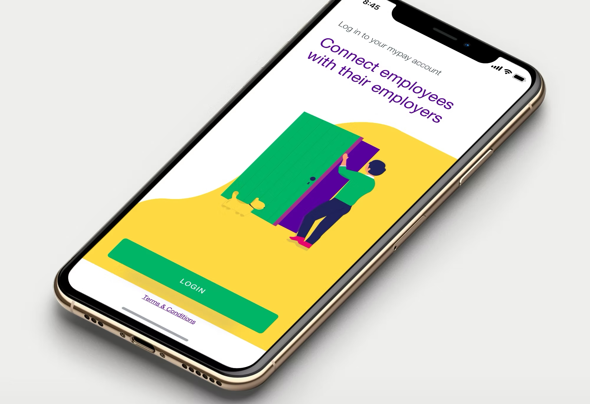
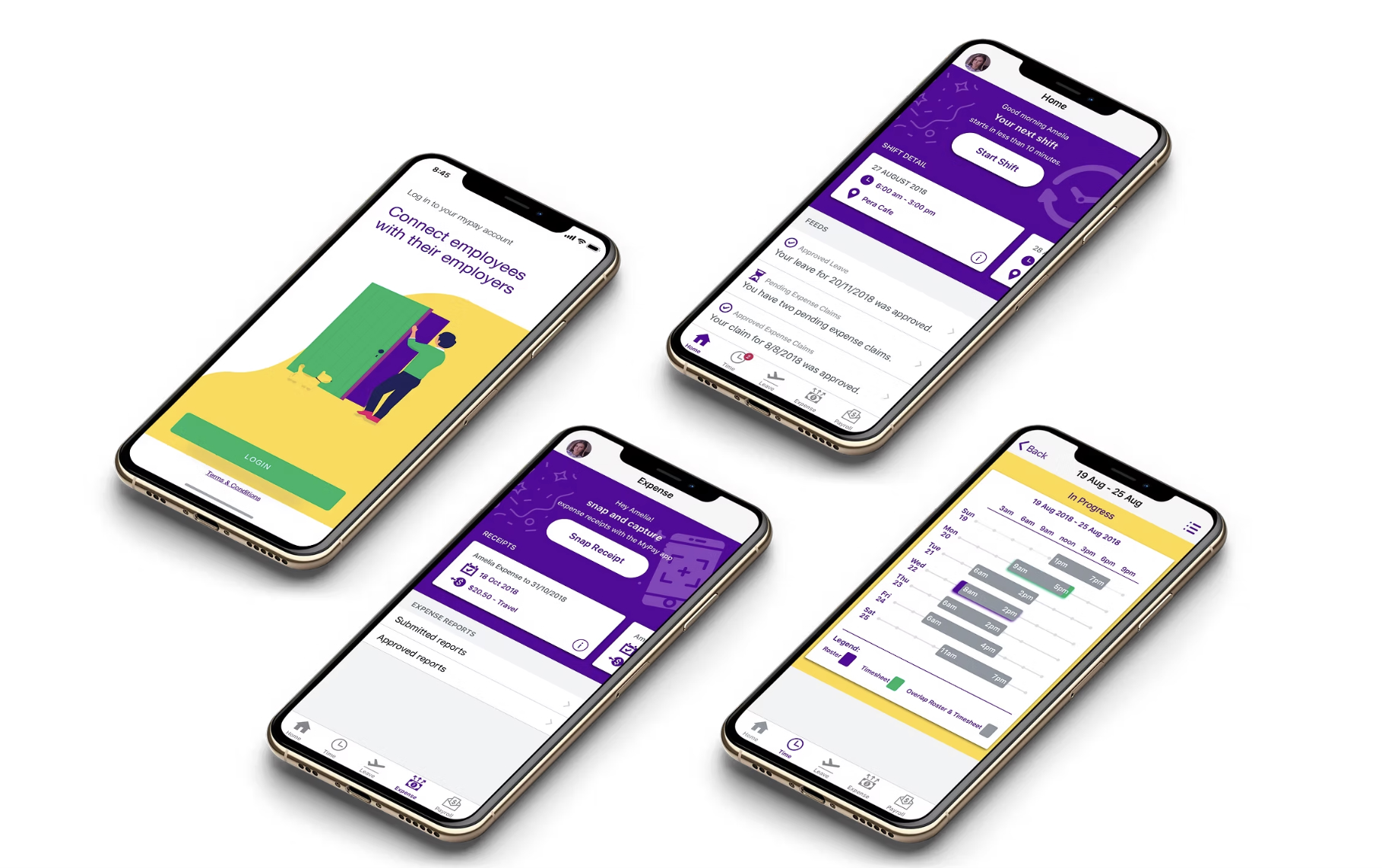
Most employees interact with payroll systems exactly twice: when something goes wrong with their timesheet, and when they want to take leave. In both cases, the interaction is typically a phone call, a form, or a conversation they'd rather not have. MyPay was built to eliminate that friction — giving employees direct, self-service access to timesheets, payslips, leave balances, and expense claims from their phone.
Built for MYOB through Propel, the project followed a structured research-to-prototype cycle — beginning with explicit hypothesis formation before any design work started.
The Challenge
Designing for users who don't choose to be there
Consumer apps have the luxury of optional engagement. Payroll apps don't — employees use them because they have to, not because they want to. That changes everything about how you design the experience. Low tolerance for confusion, zero patience for extra steps, high emotional stakes when something looks wrong.
The existing MYOB payroll experience was built for the employer side — for payroll administrators with domain knowledge of the system. The employee-facing layer was an afterthought. Our job was to invert that priority.
Approach
Hypotheses first — then research to test them
Rather than starting with a broad discovery phase, I framed explicit design hypotheses upfront — specific, falsifiable assumptions about what users needed and why. This approach sharpens research: instead of asking "tell me about your experience with payroll," we could test concrete assumptions and either validate or refute them.
Hypothesis A
"Employees who frequently submit timesheets prefer to do so incrementally — logging hours same-day rather than reconstructing the week at the end of a pay period."
Hypothesis B
"The most anxiety-producing moment in payroll is discovering a discrepancy between expected and actual pay — and employees want to understand why, not just see the number."
Hypothesis C
"Leave balance visibility is the single most-checked feature for casual and part-time employees — more than payslip history or expense tracking."
Research validated all three — and added nuance. Same-day timesheet submission was correct, but the trigger was environmental (end of shift, not end of day). Payslip anxiety was highest in the first 6 months of employment. Leave balance checking spiked before public holiday periods.
Process
From validated hypotheses to shipped product
Hypothesis Formation
Formulated 8 explicit design hypotheses across the four modules, drawing on MYOB's existing payroll data and a literature review of HR self-service research.
Generative Research
Interviewed 14 employees across retail, hospitality, and professional services — the three highest-volume payroll categories in MYOB's customer base. Sessions focused on existing payroll touchpoints, pain moments, and mental models around pay and leave.
Architecture & Wireframes
Designed the information architecture around the validated mental models: primary navigation by action type (not by MYOB's internal module structure), with a home screen surfacing time-sensitive information (next payday, pending timesheets, leave approvals awaiting).
Prototype Testing
Ran two rounds of usability testing on interactive Figma prototypes with a different participant pool from discovery. Testing focused on task completion for critical paths: submitting a timesheet, checking leave balance, and understanding a payslip breakdown.
Design QA & Handoff
Produced a comprehensive component spec for both iOS and Android, accounting for platform-specific interaction patterns and MYOB's API response structures.
Key Design Decision
Making payslips legible, not just visible
Standard payslip display in MYOB was a data dump — every line item from the payroll system, formatted for print. On mobile, that's unreadable. The design decision: surface a simplified summary view (gross pay, tax withheld, net pay, super) as the default, with a detailed breakdown one tap away. Employees who just wanted confirmation saw what they needed immediately. Those who spotted something unexpected could drill in.
"The goal wasn't to show less information. It was to sequence it in the order employees actually need it — answer the main question first, then make the detail available."
Outcome
A research process that held up under testing
The hypothesis-first approach proved its value in usability testing: task completion rates on first-attempt were high across all three primary flows, and qualitative feedback from testers aligned closely with what the generative research had predicted. When research and design are built on explicit assumptions, you know what you're testing — and the results are legible.
The structured process also meant that stakeholder conversations were grounded in evidence, not taste. When decisions were challenged, we could point to a specific hypothesis test result rather than a designer's judgement call.