The Result
Overview
When a small widget carries enormous weight
The child selector widget is the centrepiece of World Vision Australia's child sponsorship flow — the moment a potential sponsor browses available children, selects one, and begins a relationship that can last years. It's emotionally significant, commercially critical, and at the time, failing on mobile.
Via SleevesUp, I was engaged to diagnose the conversion problem and redesign the widget for mobile-first performance — with the outcome validated through a properly structured A/B test.
The Challenge
A desktop pattern stranded on mobile
The existing child selector was designed for desktop — a grid-based browsing interface with multiple filter options, small profile images, and dense text. On mobile, this translated to a cramped, hard-to-interact-with experience that required significant scrolling and precise tapping to navigate.
For a moment that is inherently emotional — choosing a child to sponsor — the experience was doing the opposite of what it needed to do. Instead of facilitating connection, it was creating friction.
"The original widget was a grid layout that worked fine at 1200px wide. At 375px — where the majority of World Vision's mobile traffic was — it was a mess."
Design Decisions
What changed — and why
Card-first navigation, not grid browsing
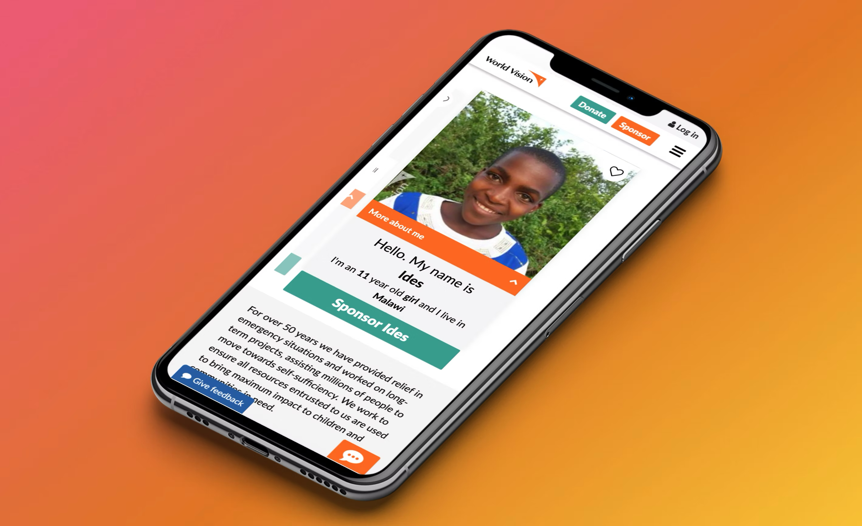
Replaced the multi-column grid with a swipeable card format on mobile. One child at a time, full-focus. This matched the mental model of a significant personal choice — you don't speed-browse a child to sponsor the way you browse a product catalogue.
Larger, high-quality imagery
The original widget used thumbnail-size images. The redesign used full-width imagery that occupied most of the card — making the emotional connection more immediate. Images were also optimised for mobile load performance.
Progressive disclosure of details
Child details (name, age, country, interests) were shown in layers — essential info visible immediately, deeper profile accessible on tap. This reduced visual overload on initial view without removing the personal detail that drives connection.
Simplified filter interaction
Replaced the desktop-style multi-filter panel with mobile-appropriate filter chips — one row, horizontally scrollable. Most users only filtered by one dimension (country or gender); the redesign optimised for that case while preserving access to the rest.
Clear, persistent CTA
The sponsor button in the original widget was positioned below a variable amount of content — on some cards it was visible, on others it required scrolling. The redesign fixed the CTA at the bottom of the card, always visible, always reachable.
A/B Test
Validation through controlled experiment
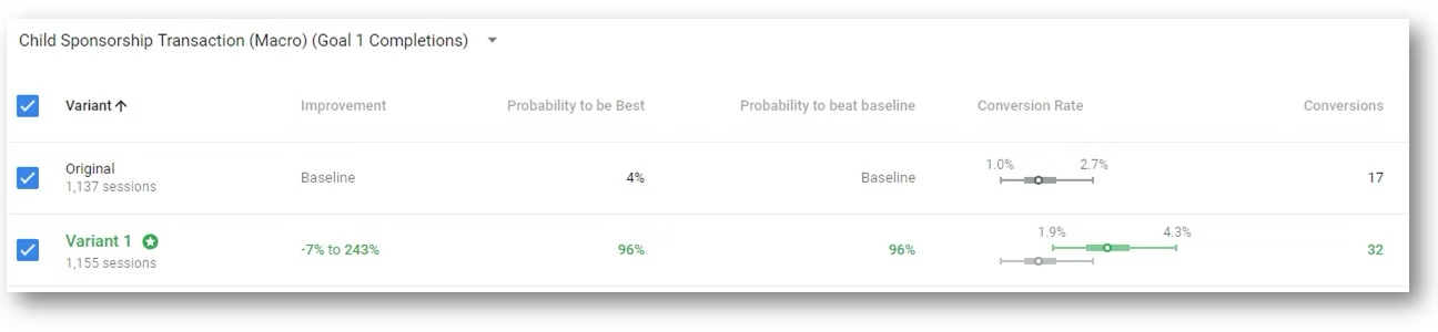
The redesigned widget was tested against the original in a properly structured A/B test on World Vision Australia's live website — equal traffic split, sufficient sample size for statistical significance, conversion (sponsor button click → form completion) as the primary metric.
The 4.3% vs 2.5% conversion difference represents a 72% relative improvement. For a donation-driven organisation, this kind of uplift translates directly into more children sponsored — not a UX metric, a mission metric.
Reflection
Design as mission-critical infrastructure
This project reinforced something I believe firmly: in nonprofit digital — and anywhere there's a high-stakes conversion moment — the quality of the design is not aesthetic, it's operational. A 1% improvement in child sponsorship conversion means more children supported. The stakes make the craft matter differently.
The A/B test process was also a reminder of why validation matters. The design decisions seemed obvious in hindsight. Before the test, they were educated bets. The test converted them into evidence.